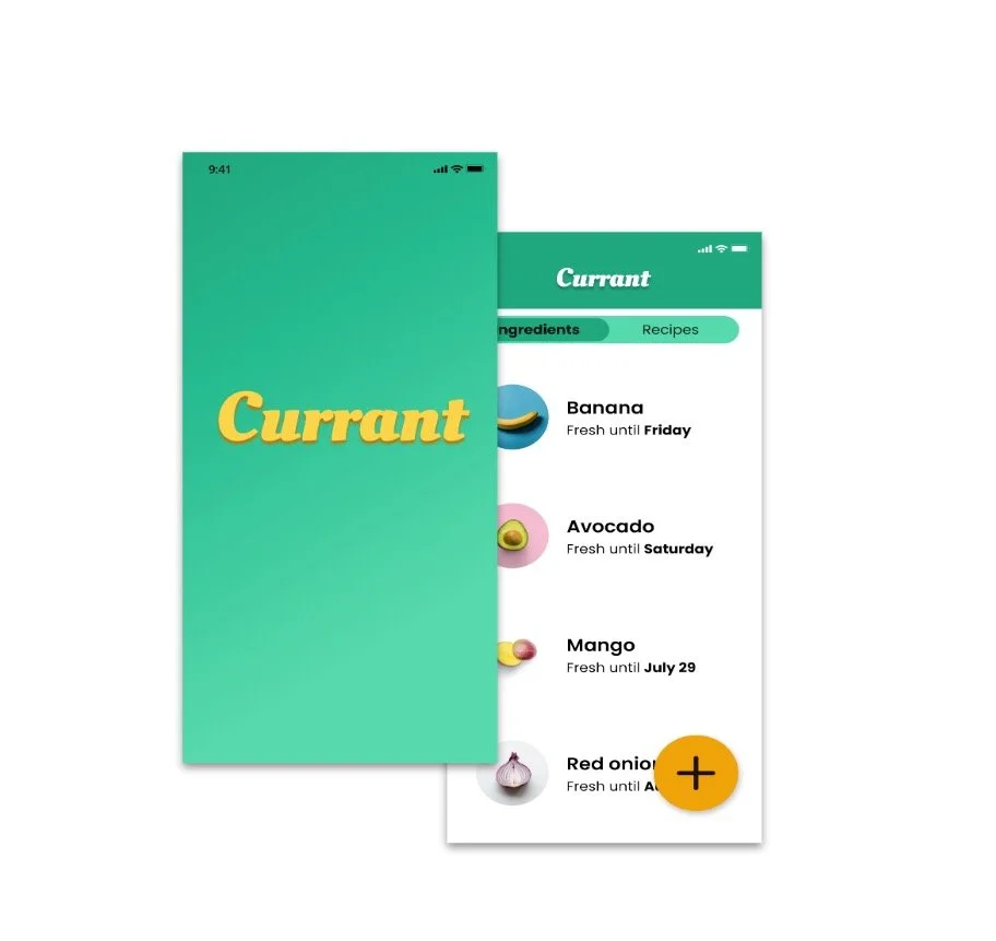
Currant
Inspiring home chefs to use ingredients they have already so they can avoid extra trips to the store.
Currant is an app design for iOS, submitted as my final project for General Assembly’s UX Design course. Over ten weeks in summer 2022, I mastered user experience fundamentals, learned Figma, and iterated on my final design.
Role
Researcher and Designer
Completed
July 2022

Research
The objective of my research was to understand the pain points of purchasing locally grown produce.
During the summer months I visit a farmer’s market in East Portland. Typically I’ll buy a coffee and a pastry. I’ll browse the fruits and vegetables, but I rarely buy anything fresh because I haven’t worked it into my meal plan.
I was curious if I’m the only one with this problem, and if there’s something here that can be solved with UX design. Using Otter.io transcription tools, I recorded interviews with five people who cook at home regularly, exploring their pain points when it comes to purchasing local fresh produce.
Sample questions
Where do you buy your fresh fruits and vegetables?
How do you approach food waste in your household?
When was the last time you shopped at a farmer’s market? What did you buy there?
Do you use recipes while cooking? Where do you find them?
“Eating seasonal produce is more sustainable and more healthy”
“We love food so it seems like a natural place to spend a bit more”
“I work Sundays and can’t make it to the Farmer’s Market”
“Curbside pickup is a gamble on quality”
“It makes me feel like a bad person to waste food”
Synthesis
The users I interviewed didn’t have much interest in farmer’s markets. They might shop there as a fun outing, but not on a regular basis.
Meanwhile, there wasn’t much interest in food delivery services that didn’t allow users to make their own choices when it comes to the quality of their fresh ingredients. Currant is not the next Hello Fresh or Instacart for that reason.
These user interviews were an excellent lesson: you are not your user. I shelved my own desire for an app focused on farmer’s markets and instead got to work dialing into what users actually need
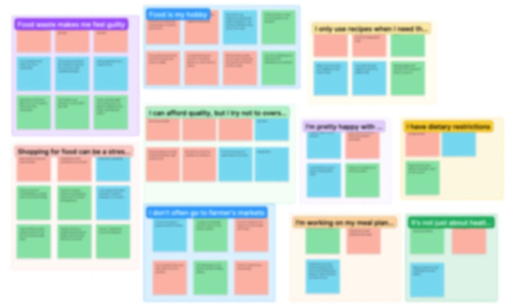
I reviewed interview transcripts in Otter.io and pulled key quotes into Figjam in order to create an affinity map.
Insights
For my users, cooking isn’t just about getting food on the table. It’s their hobby, plus it’s a way to connect with their partner.
Users hate wasting food on a cultural level. For them, it’s not always a matter of money or sustainability. Rather, they feel guilty about not following through on best laid plans.
Finally, users shop mostly at local grocery stores, but they don’t enjoy shopping. They’d rather spend less time at the store and more time doing the fun part: actually preparing their food.
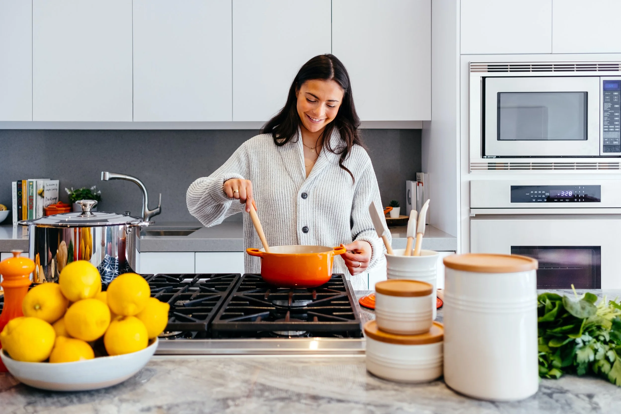
Meet Stella
Stella, of course, is fictional, but all of her characteristics are drawn from real people I talked to in my research. She’s a millennial and lifelong pescatarian, who lives with her partner in Colorado. Cooking helps her destress from her event planning job. She finds grocery stores overstimulating and tries to avoid shopping at peak times.
Photo courtesy of Jason Briscoe on Unsplash.
Ideation
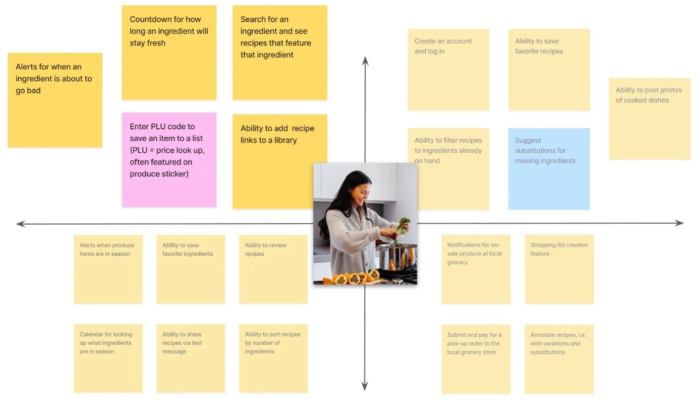
Keeping Stella at the center of it all, I brainstormed features and arranged them according to value and complexity using Figjam. The high-value, low-complexity features in the upper left quadrant became my top priorities.
Minimum viable product
Freshness alerts
Editable ingredient list
Save links to online recipes
Search recipes by ingredient
Scan PLU code
Sketches and wireframes
At this point, I started sketching what some of these features and solutions might look like in-app in a time-boxed exercise.
Highlighted here are some early ideas for a recipe browser and ingredient list.
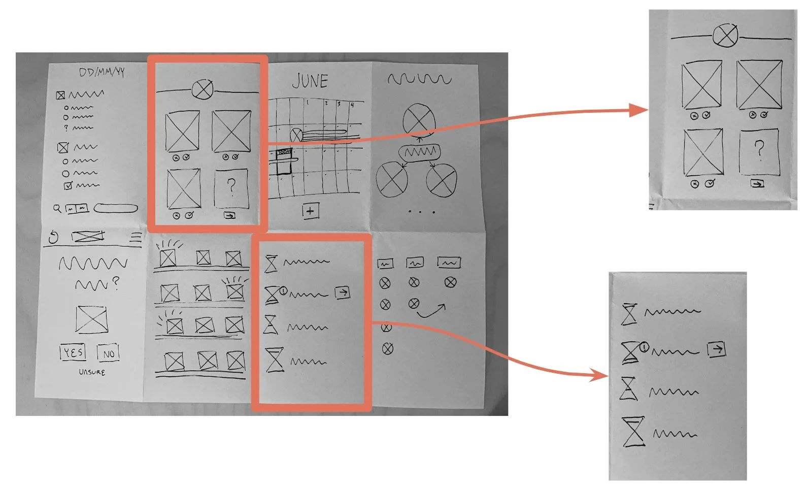
Beginning to build a user flow, I sketched this analog wireflow using some of my favorite layouts from my earlier sketches.
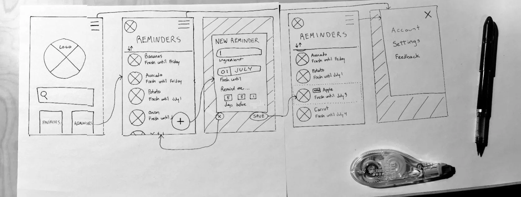
At last, Currant goes digital. These low-fidelity wireframes, built in Figma, allowed me to test out Currant’s navigation and usability with real users.
Usability testing
I didn’t get it right on the first try.
I asked a group of testers to perform a core task: to add a reminder for when a certain ingredient would spoil.
While some users succeeded in adding an ingredient reminder easily, others seemed lost as they tapped their way around the Figma prototype in the first round of moderated testing.
☺︎
Two testers added a reminder without misclicks
Pre-set reminder modals are handy
☹︎
“Where is home? Am I already home?”
Not clear that lists are scrollable
One tester tried Settings, Notifications, and Recipes before Reminders
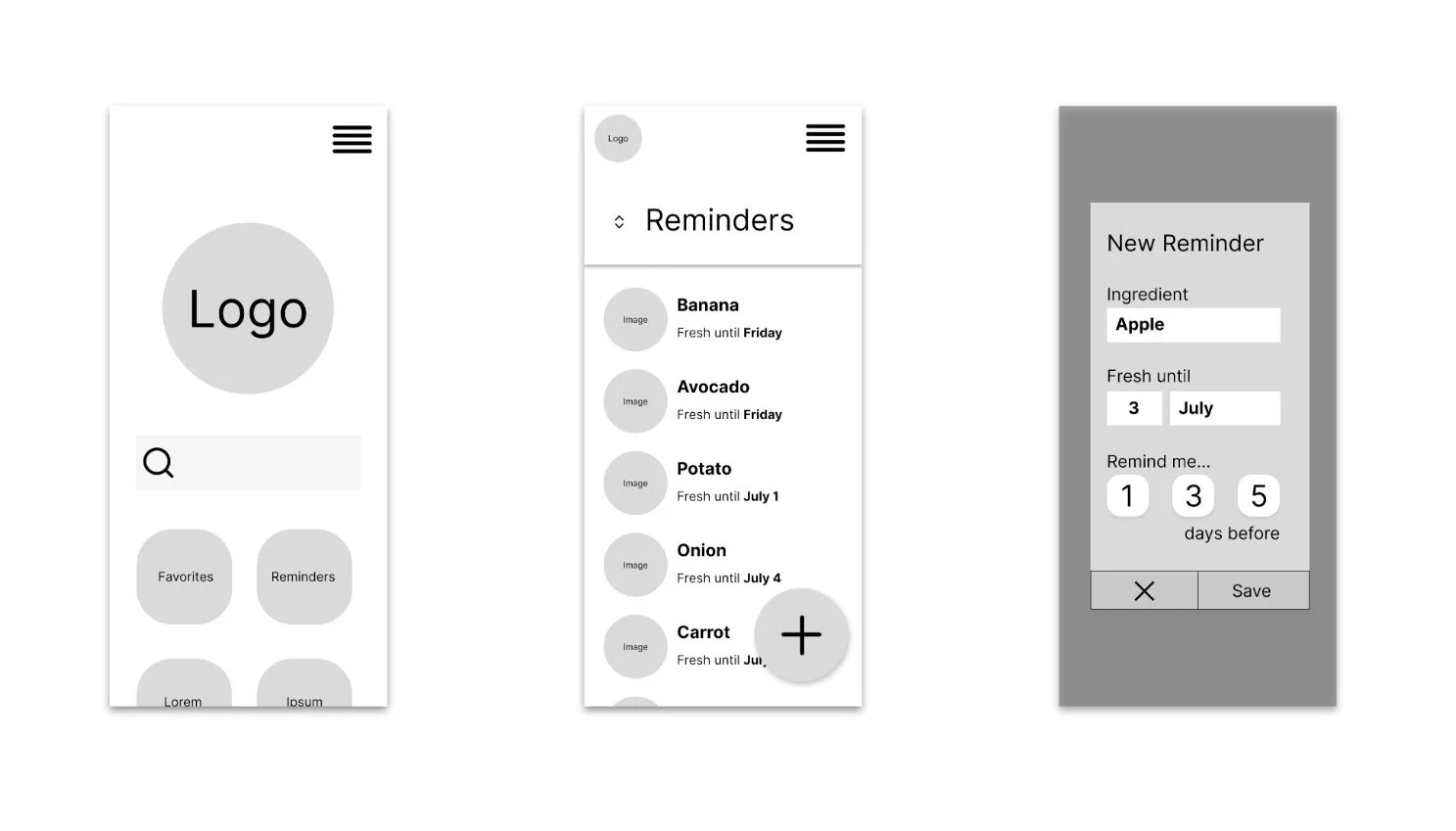
Iteration
-
Color
Google’s Material Design Color Tool aided me in building a color palette based on green berry containers. The Call to Action stands out in a bright secondary marigold color.
-
Brand moment
I chose to remove the search-centric home screen, replacing it with a quick brand moment that dissolves into the ingredient list.
-
Slider navigation
This pill-shaped slider used by Letterboxd and Apple’s Photos is a handy way to quickly switch between interrelated lists.

-
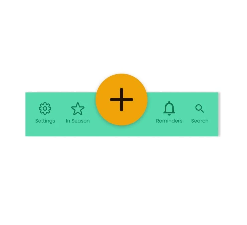
Labeled icons
At this stage, the floating call-to-action ceased to float, and icons received text labels to eliminate ambiguity.
More testing
With a mid-fi prototype, I began unmoderated usability testing.
This time the tests were unmoderated, performed using Maze. I asked this new cohort of testers to:
Add a reminder
Delete the reminder
Find a recipe featuring bananas
Add a new recipe
Testers had an easy time adding a new ingredient and finding recipes inspired by that ingredient. On the other hand, deleting or dismissing a reminder was not at all intuitive.
☺︎
Unanimous “Easy” feedback on adding ingredients and browsing recipes
“Makes it easy to explore options for what to make”
“I love the simplicity”
☹︎
“I expected to be able to tap on an item to delete it”
“I wish there was a way to bulk-add produce”
Half of testers avoided the CTA for adding a new recipe

One big problem
This last round of testing highlighted a problem in the design. What happens in the app when users successfully consume their ingredients before they spoil? In other words, how might we reward Stella for eating that banana?
One possible solution
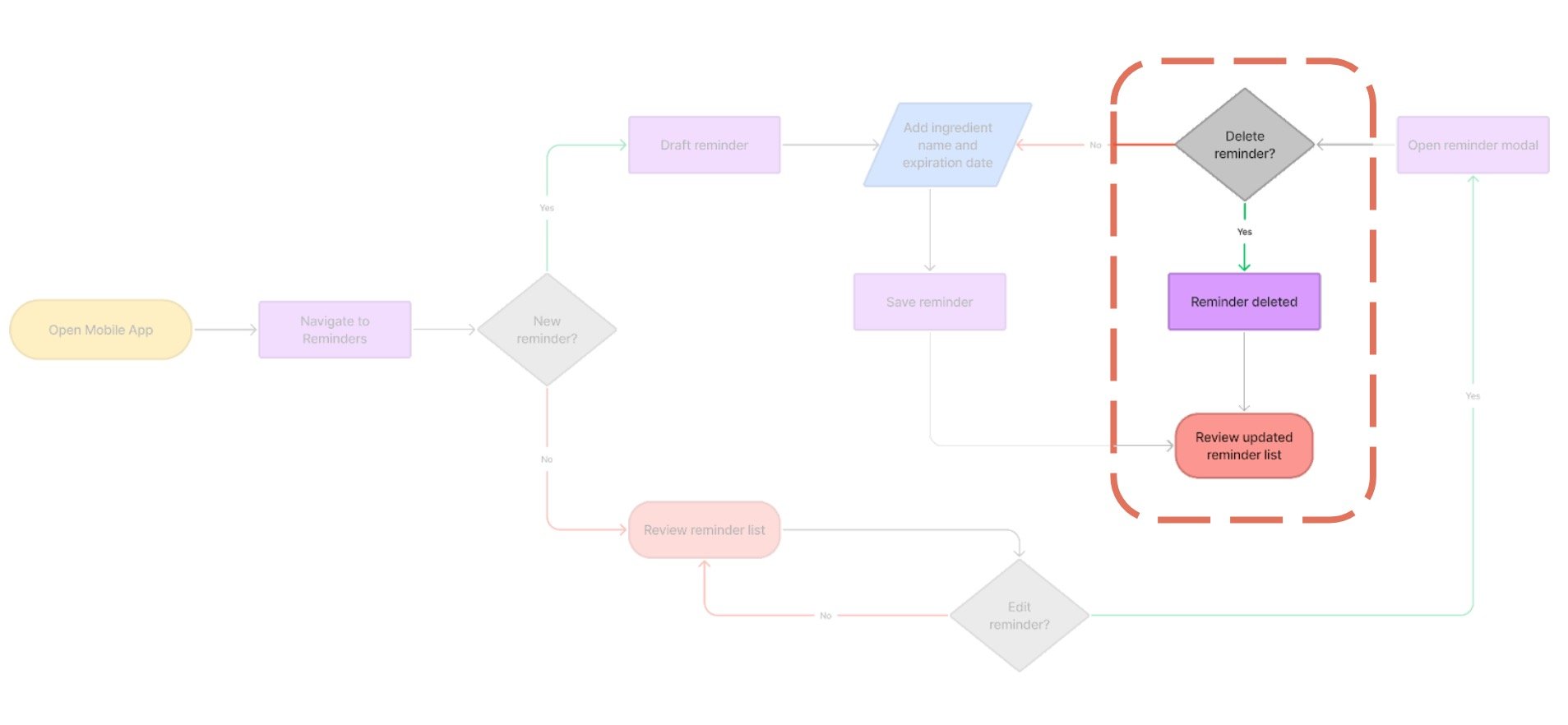
This section of the user flow needed some work.
Removing ingredient reminders is key to unlocking Stella’s happy path. Of course she wants to use up all her ingredients before they spoil. When Stella eats that banana, it’s a celebratory moment.
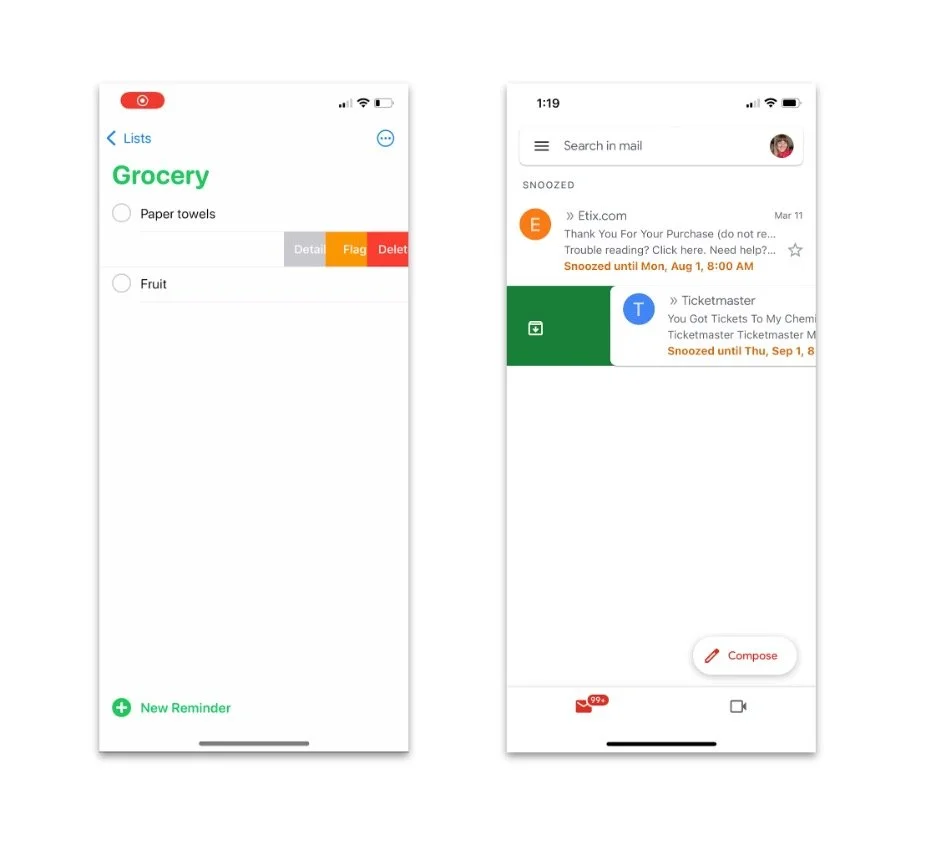
This time, I drew inspiration from Apple’s Reminders app, and from Gmail for iOS. Items in a list can be dragged left or right to archive or delete.
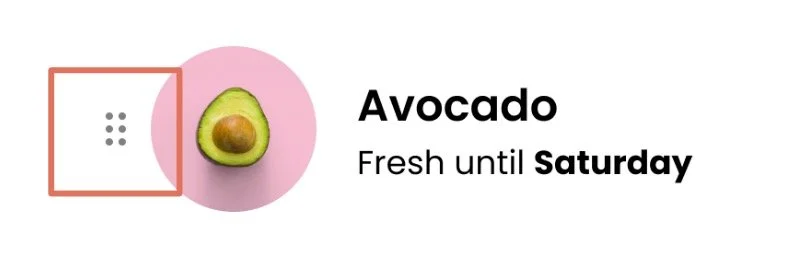
On Currant, a dotted icon implies texture, and gives users a hint that these cards can slide to the right.

Try the prototype on mobile or in your desktop browser
Next steps

To-do list
Iterate edit and delete gestures
Celebratory moments
Recipes onboarding
Research collaborative lists
Moving forward, I’d want to iterate on gestures for adding and deleting until usability tests are more positive.
Currant also needs some celebratory moments, possibly taking advantage of haptics to underline a sense of reward when Stella uses an ingredient before it spoils. Based on user feedback, the Recipes function could benefit from onboarding tooltips.
And finally, I’d like to start sketching a collaborative ingredient list for Stella and her partner to share when cooking together.